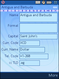
The Card View, available only if a stack is open, shows one card of a stack at a time, the current card, in detail i.e. with all the fields and controls and current field values, and offers a number of handy (but non-obvious) time-saving functions described below. The menus of this view and their commands are described in a separate chapter Card View Menus.
One usually designs a card so that there is no need to scroll, with all fields and controls visible at the same time, but if necessary, you can configure a scrolling card view with the help of the Scrollable? background flag (see also Edit Backgrounds window).

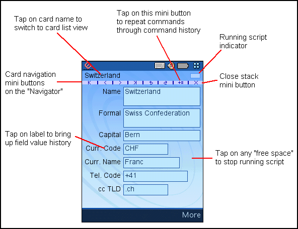
Top left the name of the current is displayed. Top right is the script execution progress indicator. Below the card name is the Navigator, something like a very small button bar, taking up less precious screen real estate than a standard UIQ button bar and double-serving as a boundary between card name and the fields. For details about the "mini buttons" see below.
The card view offers a number of non-obvious features that are available by tapping on the various elements. (That these features are "non-obvious" i.e. without any visible hint that they exist should not be considered bad design, but a consequence of the very small screen.) The following schema summarizes them:

- A tap on the card name switches to the Card List View - easier than using the corresponding command in the Stack menu.
- A tap on a field label brings up a sophisticated list of field values with historical and "near" values, making typing unnecessary in many cases (for fields without labels also available through the Values command in the Field menu).
- There is a mechanism that allows repeating commands quickly and easily through a command history shown in a popup menu available through a mini button on the Navigator.
- A tap anywhere on the card view where the background is shown ("free space") stops the execution of any running script.
The Navigator offers a number of "mini buttons" with commands that are frequently needed:
![]()
The commands, from left to right:
- First: Go to the first card of the stack, according to the current order of all cards.
- Previous: Go to the card immediately before the current card, if any.
- Next: Go to the card immediately after the current card, if any.
- Last: Go to the last card of the stack.
- Back: Go back to the previously current card, according to the card history, if any.
- Forward: Go forward again in the card history, after the the Back command was used.
- Command History: Bring up a popup menu with a command history to easily repeat an earlier command.
- Close: Close the current stack.
The first 6 buttons correspond with the commands of the Go menu, and the last with the Close command in the Stack menu. There is no absolute need to use the Navigator, but on the other hand navigating stacks solely with the help of menu commands is rather tedious. See also chapter Keyboard-Only Operation.
Note that you can configure a background to not display card name and navigator to get more room for the controls with the help of the flag Show card name?. See the Edit Backgrounds Window of the Windows program.
The fields and controls on the view are mostly standard UIQ controls, and you operate on them in the normal way to edit values, tap buttons, etc. Note however that no "stand-in" controls are used for text fields, and it's not possible to navigate between the fields only with the help of the keyboard. Read more about the reasons and the reasoning behind this in chapter Keyboard-Only Operation.
Numerical fields (for whole and for real numbers) in MoStacks however offer some non-standard features described in chapter Numeric Fields.